


Table of contents
- 1. Introduction to CSS and its purpose
- 2. Understanding the CSS syntax and structure
- 3. Working with colors and backgrounds
- 4. Using font styles and sizes
- 5. Adding margins, padding, and borders
- 6. Positioning elements on the page
- 7. Working with floats and clears
- 8. Creating basic layouts with CSS
- 9. Responsive design and media queries
- 10. Tips and best practices for writing clean and efficient CSS code
- Conclusion
Ever come across a website with a design so captivating it left you in awe😍? Meet CSS, the magic behind those intricate designs and layouts. Short for cascading style sheets, CSS allows web developers to customize the styles of their web pages. CSS brings web pages to life from the overall design to the layout and display variants for different devices. And the fun doesn't stop there - the possibilities for creating visually stunning and user-friendly websites with CSS are endless. So next time you're admiring a website's design, remember that CSS is likely the secret ingredient that made it all come together.
1. Introduction to CSS and its purpose
CSS, or cascading style sheets, allows web developers to apply styles to HTML elements like text, images, and buttons to create visually appealing and user-friendly web pages. But its purpose goes beyond just making things look pretty.
CSS separates the content (HTML) from the presentation (design and layout), making it easier for developers to focus on creating the structure and content of a website while leaving the styling to CSS. This means that styles can be reused across multiple web pages, saving time and effort in the development process.
And with the rise of mobile devices and different screen sizes, CSS ensures that a website looks and functions appropriately on different devices. So next time you're admiring a website's design, remember to thank CSS for bringing it all together and making it look effortless.
In short, CSS is an essential tool for web developers that helps them create beautiful and functional websites without the hassle of styling each element individually. So the next time you're in awe of a website's design, you know who to thank for making it all possible.
2. Understanding the CSS syntax and structure
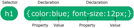
The basic syntax of CSS consists of a selector, followed by a declaration block. The selector specifies which HTML element(s) the style should be applied to, and the declaration block contains one or more declarations that define the style for the selector.
Here's an example to give you a better idea:
h1 {
  color: red;
  font-size: 20px;
  font-family: Arial;
}
In this example, the h1 selector specifies that the style should be applied to all h1 elements on the page. The declaration block contains three declarations: color, font-size, and font-family. Each declaration consists of a property and a value, separated by a colon.
CSS also has various ways to group and organize styles, such as using class and id selectors, as well as the use of nested selectors. Here's an example of a class selector:
.red-text {
  color: red;
}
In this example, the .red-text class can be applied to any HTML element by using the class attribute. Here's an example of how to use the class in an HTML element:
<p class="red-text">This text will be red</p>
Understanding the syntax and structure of CSS is crucial for web developers to effectively style their websites and create visually appealing and user-friendly web.
3. Working with colors and backgrounds
One of the most exciting aspects of web development is the ability to add color and visual interest to a website. And with CSS, it's easy to do just that! CSS allows web developers to customize the colors and backgrounds of their web pages, adding a personal touch and bringing their designs to life.
Working with colors in CSS is simple - all you have to do is specify the color property and assign it a value. There are various ways to specify a color, such as using a named color, a hexadecimal code, or an RGB value. For example:
p {
  color: blue; /* named color */
}

button {
  color: #ff0000; /* hexadecimal code */
}

div {
  color: rgb(0, 255, 0); /* RGB value */
}
In addition to colors, CSS also allows web developers to customize the background of an element. This can include setting a solid color, adding an image, or even adding a gradient. Here's an example of setting a background color:
body {
  background-color: #ffcc99; /* solid color */
}
With CSS, the possibilities for adding color and visual interest to a website are endless. So next time you want to add some pizazz to your web pages, remember to use CSS to your advantage!
4. Using font styles and sizes
Font styles and sizes are a simple way to add personality and flair to your website. Whether you want to make a bold statement with large, attention-grabbing text or create a more subtle, refined look with smaller, elegant fonts, CSS has you covered.
To change the font style of your text, you can use the font-family property. This property allows you to specify the type of font you want to use, such as Arial, Times New Roman, or even custom fonts like Google Fonts.
To change the size of your text, you can use the font-size property. This property allows you to specify the size of your text in pixels, ems, or even percentages.
But it's not just about aesthetics - using the right font style and size can also improve the user experience on your website. Large, easy-to-read fonts can make your website more accessible for people with vision impairments, while smaller, more subtle fonts can add a touch of sophistication to your design.
So don't be afraid to play around with font styles and sizes in your CSS. It's a simple way to give your website a fresh, new look and make it stand out from the crowd.
Example of creating a visual hierarchy and grabbing the attention of the user by using the right font style and size:

5. Adding margins, padding, and borders
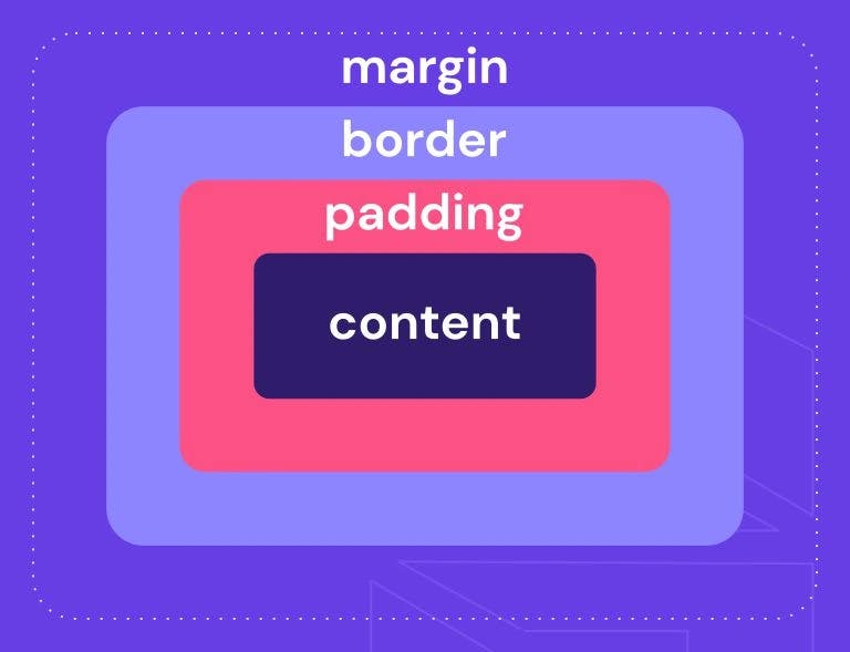
Margins are the space around an element, while the padding is the space inside an element. Both of these can be adjusted using the following CSS code:
.element {
  margin: 20px;
  padding: 10px;
}
You can also specify different margins and padding for each side of the element using the following code:
.element {
  margin-top: 20px;
  margin-right: 30px;
  margin-bottom: 40px;
  margin-left: 50px;
  padding-top: 10px;
  padding-right: 15px;
  padding-bottom: 20px;
  padding-left: 25px;
}
Borders can be added to elements to give them definition and separation from other elements. The border property can be used to add a border to all sides of an element, or you can specify a border for each side individually.
.element {
  border: 1px solid black;
}
.element {
  border-top: 1px solid black;
  border-right: 2px solid black;
  border-bottom: 3px solid black;
  border-left: 4px solid black;
}
By playing around with margins, padding, and borders, you can give your website the structure and visual appeal it needs to stand out.
6. Positioning elements on the page
Positioning elements on the page is an important part of web design. It allows us to control the placement of elements on the page, ensuring that they are displayed in the desired location. There are several different methods for positioning elements, each with its own set of benefits and drawbacks.
One way to position elements is through the use of the float property. This allows us to float an element to the left or right of the page, allowing other elements to flow around it. Here's an example of how to float an element to the right:
.myElement {
    float: right;
}
Another method for positioning elements is through the use of the position property. This allows us to specify the position of an element in relation to the parent element or the page itself. Several different values can be used with the position property, including absolute, relative, and fixed.
Here's an example of how to position an element absolutely:
.myElement {
    position: absolute;
    top: 20px;
    right: 20px;
}
This will position the element 20 pixels from the top and 20 pixels from the right of the parent element.
Positioning elements on the page can be a powerful tool for creating visually appealing and user-friendly websites. Whether you're floating elements to the side or positioning them absolutely, the options are endless and can help bring your website to life.
7. Working with floats and clears
Floats and clears are an essential part of web design, and understanding how they work is crucial for creating beautiful and functional websites.
Floats allow us to take an element and float it to the left or right of the page, allowing other elements to flow around it. This is often used to create columns or to position an element next to another element. Here's an example of how to float an element to the left:
.myElement {
    float: left;
}
However, when we float an element, it can sometimes cause issues with other elements on the page. This is where the clear property comes in. The clear property allows us to specify that an element should not be floated next to a floated element. Here's an example of how to clear an element:
.myElement {
    clear: both;
}
This will ensure that the element is not floated next to any floated elements on the page.
Floats and clears help us create complex and visually appealing layouts. Whether you're floating an element to the side or clearing it to prevent issues, understanding how these properties work is crucial for creating great websites.
8. Creating basic layouts with CSS
Creating basic layouts with CSS is an essential part of web design. It allows us to control the layout of our pages, ensuring that they are displayed in a visually appealing and user-friendly manner.
There are several different methods for creating basic layouts with CSS, including floats, flexbox, and grid.
Floats allow us to take an element and float it to the left or right of the page, allowing other elements to flow around it. This is often used to create columns or to position an element next to another element. Here's an example of how to create a two-column layout using floats:
.leftColumn {
    float: left;
    width: 50%;
}

.rightColumn {
    float: right;
    width: 50%;
}
Flexbox is another method for creating layouts. It allows us to create flexible, responsive layouts that adjust to the size of the screen. Here's an example of how to create a simple flexbox layout:
.container {
    display: flex;
    flex-direction: row;
}

.item {
    flex: 1;
}
Finally, we can use the CSS grid to create complex and flexible layouts. The grid allows us to create rows and columns and position elements within them. Here's an example of how to create a grid layout:
.container {
    display: grid;
    grid-template-columns: repeat(3, 1fr);
    grid-template-rows: repeat(2, 100px);
}

.item {
    grid-column: 1 / 2;
    grid-row: 1 / 2;
}
Creating basic layouts with CSS is an important part of web design, and there are many different methods to choose from. Whether you're using floats, flexbox, or the grid, understanding how these properties work is crucial for creating great websites.
9. Responsive design and media queries
Responsive design is an essential part of web design in today's world, where people are accessing the internet from a variety of different devices with varying screen sizes. Responsive design allows us to create websites that adapt to the size of the screen, ensuring that they are easy to use and look great on any device.
One of the key tools for implementing responsive design is the use of media queries. Media queries allow us to specify different styles for different screen sizes, ensuring that our website looks great on any device. Here's an example of a simple media query:
@media screen and (max-width: 800px) {
    .myElement {
        display: none;
    }
}
This media query will hide the element with the class myElement on screens with a width of 800 pixels or less.
Responsive design is essential for creating great websites that are easy to use on any device. By using media queries, we can ensure that our website looks great on any screen size and provides a great user experience.
10. Tips and best practices for writing clean and efficient CSS code
Here are some tips and best practices for writing clean and efficient CSS code:
Use a consistent naming convention: Choose a naming convention, such as BEM or SMACSS, and stick with it throughout your project. This will help keep your code organized and easy to read.
Avoid using overly specific selectors: Using overly specific selectors can make your code difficult to maintain and can lead to problems down the line. Instead, try to use more general selectors whenever possible.
Use shorthand properties: Many CSS properties have shorthand versions, which allow you to specify multiple values in a single line of code. For example, instead of writing the whole set of properties for margin in different lines, we can just write it in a single line.
/* very long method of writing properties */
.myElement {
    margin-top: 10px;
    margin-right: 15px;
    margin-bottom: 20px;
    margin-left: 25px;
}

/* shorthand version of the same css */
.myElement{
    /*top | right | bottom | left */
    margin:  10px 15px 20px 25px;
}
Use CSS preprocessors: CSS preprocessors, such as Sass or Less, allow you to write more efficient and organized code by adding features such as variables and mixins.
Use a CSS reset: A CSS reset is a set of styles that helps to ensure that all elements on the page have a consistent look and feel, regardless of the browser they are being viewed in. This can help prevent issues with browser-specific styles.
Here's an example of a simple CSS reset:
* {
    margin: 0;
    padding: 0;
    box-sizing: border-box;
}
By following these best practices, you can write clean and efficient CSS code that is easy to maintain and will help your website look and function its best.
Conclusion
🎉🎊🎉 That's a wrap on my CSS basics blog! 🎉🎊🎉
In this blog, we covered everything from creating styles and applying them to elements, to using selectors to target specific elements on the page.
But don't worry, we're not finished yet! In my next blog, I'll be exploring some more advanced CSS topics such as transforms, masking, animations, and working with CSS preprocessors.
I hope this blog on the basics of CSS was helpful to you. If you enjoyed it, don't forget to give it a like and share it with your friends. I'd love to hear your thoughts and feedback in the comments section below.
Stay tuned for more tips and tricks on mastering CSS. I'll see you in the next blog!